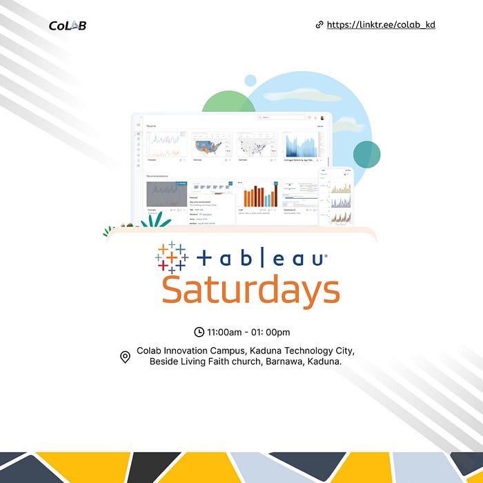
Tableau Saturday V, 9th March, 2024
I am a Product Manager from Nigeria, taking one day at a TIME and Documenting my Product Journey.
Discrete fields, Continuous fields, Bar charts, Line charts
Our sole mission is to help people see and understand data.
— Tableau©️ 2003
Hi Everyone, I would like to thank those who made it to the Tableau©️ Saturday Colab Kaduna in-person event, especially our host Sanusi Ismaila, and tutor Peter Okwukogwu aka Pablo.
Peter took us on a journey through, Tableau public, Tableau Desktop, and Python.
Tableau is visualization tool for business intelligence.
Data types determine how you can manipulate anything.
Your sheet is where you have your canvass. It's where you paint the magic.
Every tool has a menu to it.
On Tableau, you can also represent data as discrete or continuous.
We had discussions on the power of mindset, taking into consideration goals, targets, and the current local and global economic realities as distractions and reminded ourselves of the need to focus on what we can control.
He went on to introduce more menu items on Tableau.
We worked on flipping more columns and rows on Tableau sheets, we looked at filters for dimensions, wildcards, etc.
Another important distinction to make with fields is whether a field is being used as discrete or continuous.
Whether a field is discrete or continuous determines how Tableau visualizes it based on where it is used in the view. Tableau will give a visual indication of the default value for a field (the color of the icon in the Data pane) and how it is being used in the view (the color of the active field on a shelf).
Discrete fields, such as the Region in the previous example, are blue. Continuous fields, such as Sales, are green.
Discrete fields
Discrete (blue) fields have values that are shown as distinct and separate from one another. Discrete values can be reordered and still make sense.
Continuous fields
Continuous (green) fields have values that flow from first to last as a continuum. Numeric and date fields are often (though, not always) used as continuous fields in the view. The values of these fields have an order that it would make little sense to change.
When used on Rows or Columns, a continuous field defines an axis:
Bar charts
Bar charts visually represent data in a way that makes the comparison of values across different categories easy. The length of the bar is the primary means by which you will visually understand the data. You may also incorporate color, size, stacking, and order to communicate additional attributes and values.
Creating bar charts in Tableau is very easy. Simply drag and drop the measure you want to see onto either the Rows or Columns shelf and the dimension that defines the categories onto the opposing Rows or Columns.

Line charts
Line charts connect related marks in a visualization to show movement or a relationship between those connected marks. The position of the marks and the lines that connect them are the primary means of communicating the data. Additionally, you can use size and color to communicate additional information.
The most common kind of line chart is a time series. A time series shows the movement of values over time.
Creating one in Tableau requires only a date and a measure.
Using the Superstore Analysis
Navigate to the Sales over time sheet.
Drag the Sales field from Measures to Rows. This gives you a single, vertical bar representing the sum of all sales in the data source.
To turn this into a time series, you must introduce a date. Drag the Order Date field from Dimensions in the Data pane on the left and drop it into Columns. Tableau has a built-in date hierarchy, and the default level of Year has given you a line chart connecting four years. Notice that you can clearly see an increase in sales year after year shelf.
Line charts are time visual based and not quantities or numbers.
We pulled data sets from seaborn.pydata.org , we uses some time series with error bands
We were shown similar line charts in Python as well for comparison purpose.
We were also shown some visualizations by community members on Tableau Public and had access to some of their workbooks.
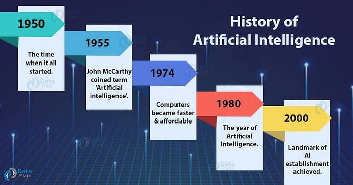
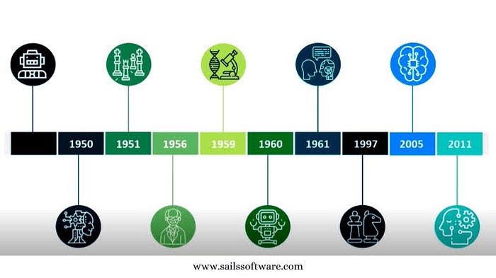
We spoke on the history and foundations of AI, its origins, and progress over the years.
I am surely looking forward to our next session for Tableau on Saturday, we will be treating iterations of line charts for deeper analysis.
Do comment below on how your journey into Tableau has been.
#salesforce
#Tableau
#data
#datavisualization
#personalgrowth
#personalgrowthjourney
#personalbranding
#communitybuilding
#communitydevelopment